 Gilles Crofils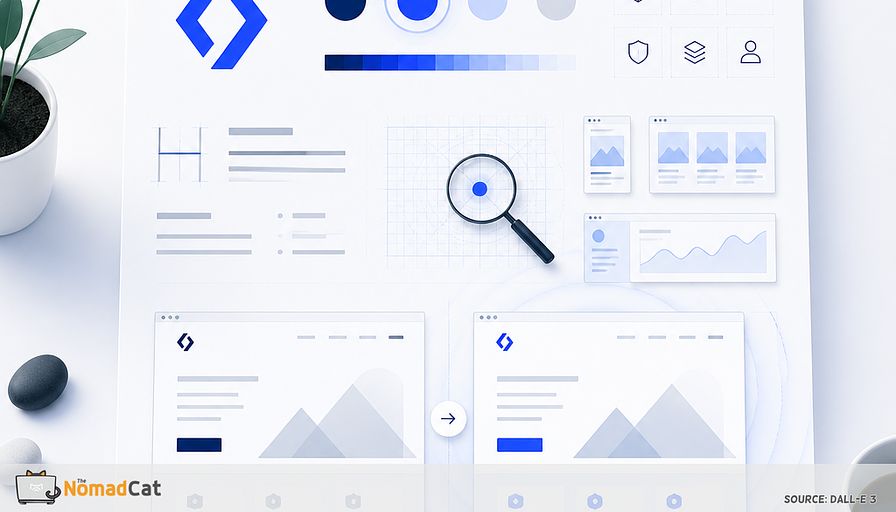
Minimalist tech brands face a unique challenge: with less clutter, every pixel, color, and icon stands out—sometimes more than I’d like. I’ve learned this firsthand, both in Berlin cafés and late nights in Beijing, where a single color tweak on our homepage sparked a flurry of Slack messages before I’d even finished my coffee. The human brain catches visual shifts almost instantly, long before words or data kick in. For brands where every detail is on display, visual storytelling isn’t just a nice touch—it’s essential for standing out and staying relevant.
I’ve found that visuals matter even more when you’re running lean. A small design tweak can shift the whole mood of your brand. I still remember when Spotify’s green got brighter, or Airbnb softened their logo—tiny changes, big reactions. Over the years, I’ve built a simple moodboard habit to keep my own brands sharp, whether I was leading a multicultural team in Beijing or working solo in Lisbon. This ritual helps me spot subtle brand drift, keep things fresh, and avoid the stress of a full rebrand. Sometimes, for me, the moodboard feels like a quick coffee break—never too serious.
In this article, I’ll share why visuals matter so much for minimalist tech brands, how I use moodboards to catch small shifts before they become big headaches, and the practical steps I follow to keep my brand on track. You’ll get straightforward language, a few jokes, and real takeaways from my own journey. Whether you’re leading a startup or just want to refresh a side project, these ideas can help you keep your brand sharp, all without the pressure of a full overhaul.
Why visuals matter for minimalist brands
How the brain reacts before words
Have you ever felt something was different on your favorite website before you could explain what? That’s your brain’s visual system kicking in. Research says we process visual info in about 100 to 150 milliseconds—much faster than words or numbers. For minimalist tech brands, where every detail stands out, this is especially important. Even a small change in color or layout can shift the brand’s feel, often before anyone can say why.
I’ve seen this play out in my own projects. Once, in Shanghai, I updated our logo color at my e-commerce startup. I kept a screenshot of the old and new homepage side by side—the new color felt like spring after a long winter. The team noticed the difference immediately, even before our metrics caught up. These fast reactions mean little design tweaks matter and can spot issues before numbers or reviews show them.
Minimalism makes this even louder—less stuff means each piece stands out more. Think of homepages like Notion or Stripe: tweak an icon or the color palette just a bit, and the whole feel changes. That’s why, for minimalist brands, every visual detail counts.
Why minimalism puts every detail in the spotlight
With minimalist branding, there’s nowhere to hide. Even a small color shift, a new icon, or a font tweak gets noticed right away. These updates can give a brand new energy if done well, or break the mood if not. I’ve learned (sometimes the hard way) that minimalist brands react strongly to visual changes, so regular visual check-ins are almost needed to stay on track.
Some cases stand out:
- Spotify’s brighter green made the app more noticeable and welcoming.
- Google’s custom sans-serif logo made things easier to read, especially on phones.
- Mailchimp’s warmer yellow and playful font increased brand searches and friendly vibes.
- Airbnb’s updated logo and font actually grew trust and engagement.
Small, careful tweaks like these are linked with better brand recognition and engagement. So, how do you catch the need for small fixes before they become big headaches?
For me, visual storytelling—using select images, colors, and layouts—acts like an early alarm for problems. It’s a creative, easy way to keep your brand fresh, avoiding a full rebrand. Regular moodboards help catch brand drift early, keeping things simple and light. Like tending a garden, small, regular tweaks keep your brand from getting overgrown. Here’s how I build a simple ritual to keep my visuals on point.
Building your minimalist moodboard ritual
Gathering your brand’s visual DNA
This doesn’t need to take ages—quick and simple is best. I start by collecting my current brand visuals. Key items are usually:
- Website screenshots
- Social media profile and banner photos
- Email templates or recent promotions
You don’t need to make them perfect. The aim is to show what’s really out there, not what you wish was there. A quick check like this shows what works and what feels off.
I also keep a simple spreadsheet to track key brand metrics—like website visits or social media engagement—so I can see if visual changes actually move the needle. This way, the moodboard isn’t just about aesthetics; it’s tied to real outcomes. Sometimes, I’ll jot down a note if I see a spike in engagement after a visual update.
Try to do this in 15 to 20 minutes. Take screenshots, save exports, or take photos of any printed things. Keeping it short stops you from overthinking so you can actually enjoy the process.
Adding some outside inspiration can bring new ideas. I like to toss in one or two outside images, colors, or layouts I find exciting for the coming months. This keeps the moodboard feeling fresh and not just stuck on what I already have. Next, let’s build your moodboard.
One-page, minimalist moodboard
Think of it like packing for a short trip—you want just the essentials on a single page. I use simple digital tools like Canva, Figma, or Milanote, or sometimes I go hands-on with a cork board. I stick to about 8 to 10 key elements so I don’t end up with a messy wall of images. What goes on the board?
A helpful moodboard often includes:
- Core color palette (2 to 4 main colors)
- Main logo or symbol
- Main font(s)
- 1 or 2 signature images
- Key icons or shapes
Leave lots of white space for clarity. This makes it easier to see what fits and what doesn’t. Minimal notes or tags help, like “website header” or “inspiration,” but keep words to a minimum. The moodboard should show, not tell.
Remember, this is a relaxed habit, not an art contest. The idea is to spot patterns, feelings, and ideas visually, not to win best design. When the pressure’s off, honest reflections come out and the routine is easier to keep up.
I also connect this ritual to decision-making. Each quarter, I review three things: (1) Visual consistency across platforms, (2) Key engagement metrics, and (3) Feedback from one trusted peer. This step-by-step framework keeps things grounded and actionable.
Now let’s talk about reading your moodboard for what’s really happening.
Reading your moodboard for subtle signals
Spotting drift and new energy
A moodboard does more than collect images. It’s a fast way to check your brand’s visual health. To see where things might be drifting, I use a simple checklist:
- Are colors the same everywhere?
- Is the right logo used, sized, and placed right?
- Do fonts and images match your style?
When I updated our logo color at my e-commerce startup in Shanghai, I kept a screenshot of the old and new homepage side by side. It made the impact of the change obvious, even before metrics caught up. The new color felt like a breath of fresh air, and our engagement numbers started to climb soon after.
You can compare your moodboard to your original guidelines or even feedback you got recently. Maybe you spot a new style in photos, or a brighter version of your main color—these small changes could mean your brand energy is shifting. Little things often mark progress or trouble.
Sometimes your gut feeling is enough to spot what’s off. If something doesn’t sit right—even if you can’t say why—that’s usually the first hint of drift. It’s pretty valid to trust these reactions.
I’ll never forget a moment in Beijing when my team and I noticed our homepage felt “off.” We couldn’t put our finger on it at first, but after laying out our moodboard, we realized a new icon style had crept in from a contractor’s update. Fixing it was quick, but the relief was real. Keeping this ritual light helps me avoid the stress of a full rebrand and keeps my work-life balance in check.
Reflective questions for alignment
To dig deeper, I ask myself:
- Does this still look and feel like us?
- Would our ideal customer care about this look?
- Is anything here old-fashioned or forced?
If I want another view, a quick check with a peer or mentor can help clear things up. Honest questions and outside input usually help see if visuals are staying true.
But feedback can be tricky. A small, trusted group is usually best—otherwise you risk the “design by committee” mess, which almost never helps.
Turning visual cues into brand evolution
Knowing when to tweak or refresh
Sometimes, a single change—like making your signature color a bit brighter or updating your main font—can revive your minimalist brand. Spotify and Mailchimp both proved that small tweaks boost recognition and positive vibes. Industry studies say even little changes to color or fonts can make people trust a brand more.
Still, sometimes things need bigger changes. If your whole moodboard feels out of sync with your audience or just old, a larger refresh might be needed. Brands like Apple and Dropbox have found that steady updates keep them relevant without losing their core style.
I follow a simple rule: if only a couple parts feel off, focus fixes there. If everything seems tired or mismatched, go bigger. Don’t change everything if you don’t have to—small steps usually work better.
Whatever you change, keeping records of your updates makes the next adjustment easier. A minimalist “just enough” approach—fix what needs fixing, keep track—works best.
Tracking changes the minimalist way
To keep a record, I just snap a screenshot or photo of each quarterly moodboard and put it in a simple folder. I write a short note on what changed and why. This way, over time I can see trends and see my choices.
Looking at these snapshots side by side shows small shifts I’d otherwise miss. People in design, construction, and even medicine use before-and-after visuals like this to make changes more obvious. It’s like a “spot the difference” game, only for your own brand.
For minimalist fans, this adds a human side to usual metrics. Like architects or doctors, you can use visual notes to track how things change, so you don’t get lost in a mess of numbers.
This process gives you a fuller view, adding feeling and context that stats often miss. These visual records help explain why a change worked, or how it landed with people.
Living between Beijing, Berlin, and Lisbon, simple visual notes help me spot whether a brand felt at home or needed a tweak. Sometimes visuals said more than metrics, catching small issues early.
Most of all, keep this process light and try to enjoy it. Let’s see how you can make this habit part of your regular routine.
Making your moodboard ritual enjoyable
Fitting the ritual into busy tech lives
Making a minimalist moodboard doesn’t need to be another dull chore. I pair it with my quarterly business reviews. When matched with other check-ins, it feels like a natural part of working life—almost like spicing up your workflow. I find it can be done in under an hour and works well with a good coffee or even as an excuse for a break. Some research suggests simple creative rituals in regular business cycles make them stick.
Add a sense of play for best results. Minimalism isn’t about being stiff or set in your ways. I try new tools, put in fresh inspiration, or take a small risk. Sometimes my best ideas pop up when the mood is easygoing. Harvard Business Review points out that playful habits in tech can spark better ideas and make the work more fun. If you like, sharing your moodboard can give you a new angle—sometimes a different person catches things you miss.
I remember feeling anxious before sharing my first moodboard with a mentor in Berlin, but the honest feedback helped me see my brand with fresh eyes. If you worry about staying relevant or feeling isolated as an indie tech pro, this simple ritual can help you feel more in control.
Sharing for feedback (if you want to)
Sharing your moodboard with a few peers or mentors is a quick, easy way to spot new ideas or trouble areas. Simple sharing works—send a screenshot, mention it in a short call, or use a shared board online. These easy steps can sharpen your direction and help you see differently. But, too much feedback can just cause confusion and make your vision fuzzy.
Keep the group small and be clear on what kind of feedback you’re after. Too many voices, or vague feedback, quickly makes things slow and messy. Design Council UK found that clear limits help keep things smooth and bring in just the right amount of outside thinking.
In the end, this ritual is for your own clarity and creative spark—not about chasing a bunch of opinions. Sharing is always up to you. The real reward is seeing your brand with a new perspective and some fresh ideas. If you keep things light and focused on what works for you, this moodboard habit gets easier and more enjoyable over time.
Minimalist tech brands do well when every visual gets the focus it needs. The smallest change to color, font, or icon can shift how people feel about your brand, sometimes even before they figure out what’s changed. Regular moodboard habits help you notice these shifts early, keeping things sharp without stress. By keeping it simple, visual, and a little playful, you can spot what makes your brand unique and guide it naturally. Whether working solo or with a trusted peer, these check-ins bring clarity, unlock creativity, and—at least for me—make the work feel a little more human.


